As per the last feedback I steered away from using the RE letters as a design element.
There were quite some different ideas in my head and as last time I will guide you trough my process instead of presenting you just two or three options. Experience says that there are some wildly differing opinions about what is a good draft and even stuff I began to dislike while working on it found some admirers here. I share an office with other designers and got a lot of feedback from them already, and the bottom line is: A lot is left to personal taste, even among professionals 😉
Anyway, here we go!
Last first
Last 1
Last 2
Spend way too much time trying to get something out of the Rhombus of the first round without the huge letters. The puzzle idea was a quick draft later on that I could not get myself to ditch entirely. Anyways, these two lost the vote of my coworkingspace, so godspeed probably.
Outside the Box
Outside Box 1
Outside Box 2
The visual metaphor is of course “Thinking outside the box”. Speaking of box: The inverse box shadow is optional in most drafts here. I’m a fan while some design purists here sneer at the idea of having that kind of decoration in a logo. But there are enough professional artists here that share my opinion: “It looks cool and it’s not the 1990s anymore, nobody needs to screenprint a logo anytime soon so go for it.”
Speaking of Boxes
Boxes 1
Boxes 2
Boxes 3
Boxes 4
Boxes or blocks, as feedback also was that some kind of coherence with the former block theme of the old logo would be a nice touch.
It would be possible to tilt the typography as well, as seen in the drafts above.
The puzzle idea found quite some live among my peers but it should be clear, that this is a draft! The connections between the pieces look way off right now but it would take some time getting that right. No point in polishing what may get ditched as long as you get a good idea of what the finished version would look like.
Speech
Speech 1
Speech 2
Speech 3
The third one sparked reactions from “meh, boring” to “bold simplicity, absolute favorite.” I’m rather fond of it.
Speechbulb
Speechbulb 1
Speechbulb 2
Speechbulb 3
I did like the speechbulb so it’s got its own drafts.
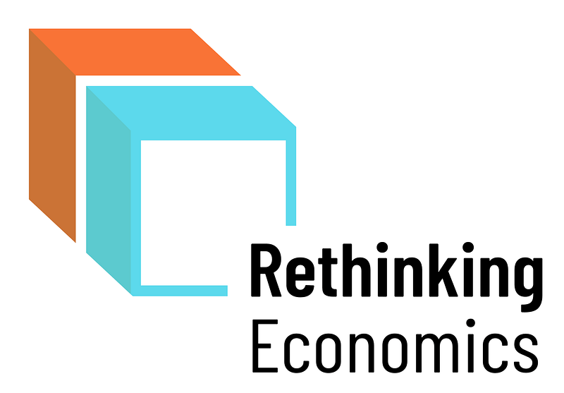
Let's meet at the corner
Corner 1
Corner 2
Corner 3
One of the favorites among my fellow graphics enthusiasts.
Pros: -Nice and subtle visual metaphor of thinking around the corner -Dynamic yet simple -Can also be seen as building block again -Bottom row can be used for additions
Cons: -Does not really work well without the typography
Summary
I’m a fan of the Speech 3 or Speechbulb 1 when it comes to designs that can be used without any typo. Looking forward to your feedback!