I focused on two design concepts and tried to elevate them further.
Boxes
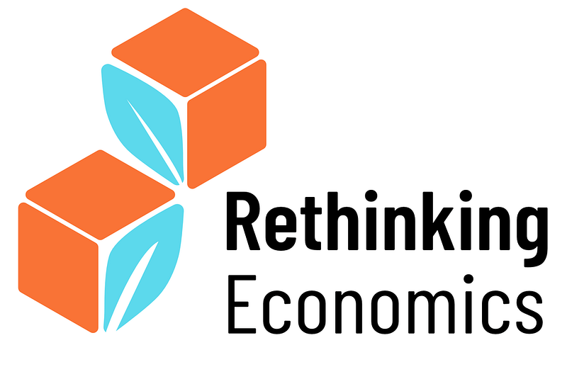
Boxes 1
Boxes 2
Boxes 3
I like the leaf sprouting out of the letters, makes a nice visual connection to emphasize the “Rethinking = New and fresh thinking / growing movement”
Double Bubbles
Bubbles 1
Bubbles 2
Bubbles 3
The idea was to visualize progressive discourse and participation, thus the second speechbubble. I had a ton of slightly different concepts and at last I realized I could create a very stylized human head as well by rotating the second speech bubble.
I included the last one just to show again, what an inversce box shadow might add 😉 Also I still like it’s simplicity, very recognizable.
Leafy Bubbles
Leafy 1
Leafy 2
Leafy 3
Leafy 4
I like the 4th one best. The first one also has it’s perks: The leaf gives the impression of a person talking.